
Scaffold 란
Flutter 에서 Scaffold는 기본 Material Design visual layout 구조를 구현하는 데 사용됩니댜.
Material Design에 대해서는 아래 링크를 참조 바랍니다.
https://material.io/design/
Scaffold는 범용 모바일 애플리케이션을 만들기에 충분하며 기능적이고 응답성이 뛰어난 앱을 만드는 데 필요한 거의 모든 것을 포함하고 있습니다. 일반적으로 앱 화면을 구성하기 위한 뼈대라고 생각하시면 됩니다.
Scaffold를 생성을 할 때 생성자 parameter에 Widget을 넘겨 줌으로써 기능을 하나 씩 추가를 하게 됩니다.
class Scaffold extends StatefulWidget {
  const Scaffold({
    Key key,
    this.appBar,
    this.body,
    this.floatingActionButton,
    this.floatingActionButtonLocation,
    this.floatingActionButtonAnimator,
    this.persistentFooterButtons,
    this.drawer,
    this.endDrawer,
    this.bottomNavigationBar,
    this.bottomSheet,
    this.backgroundColor,
    this.resizeToAvoidBottomPadding,
    this.resizeToAvoidBottomInset,
    this.primary = true,
    this.drawerDragStartBehavior = DragStartBehavior.start,
    this.extendBody = false,
    this.drawerScrimColor,
    this.drawerEdgeDragWidth,
위 생성자 parameter 중 가장 범용적으로 사용하는 기능을 소개하겠습니다.
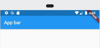
Appbar
Application 최 상단에 위치하고 있는 bar를 말합니다.
아래와 같이 Scaffold 생성자에 AppBar를 전달하면 간단히 생성이 됩니다.
class MyApp extends StatelessWidget {

  @override
  Widget build(BuildContext context) {
    return MaterialApp(
      home: Scaffold(
        appBar: AppBar(title: Text('App bar'),),
      )
    );
  }
}
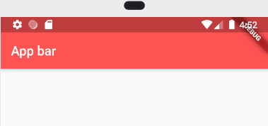
backgroundColor 값을 변경하여 아래와 같이 배경색도 변경이 가능합니다.
class MyApp extends StatelessWidget {
  @override
  Widget build(BuildContext context) {
    return MaterialApp(
        home: Scaffold(
      appBar: AppBar(
        title: Text('App bar'),
        backgroundColor: Colors.redAccent,
      ),
    ));
  }
}
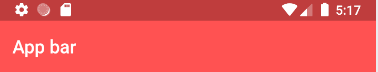
참고로 Appbar 우측 상단에 debug 뱃지가 거슬린다면 Material Widget에 debugShowCheckedModeBanner을 false로 set을 하면 아래와 같이 깔끔하게 없어짐을 확인 할수 있습니다.
Widget build(BuildContext context) {
    return MaterialApp(
        debugShowCheckedModeBanner: false,
        home: Scaffold(
          appBar: AppBar(
            title: Text('App bar'),
            backgroundColor: Colors.redAccent,
          ),
          body: Text('This is body!!'),
        ));
  }
AppBarclass에 좀 더 자세한 내용은 아래 링크를 참고 바랍니다.
https://api.flutter.dev/flutter/material/AppBar-class.html
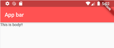
Body
Appbar의 밑의 영역을 body라고 부릅니다.
body는 하나의 Widget만 가질수 있으며
아래와 같이 간단하게 Text Widget을 추가 해보았습니다.
class MyApp extends StatelessWidget {
  @override
  Widget build(BuildContext context) {
    return MaterialApp(
        home: Scaffold(
      appBar: AppBar(
        title: Text('App bar'),
        backgroundColor: Colors.redAccent,
      ),
      body: Text('This is body!!'),
    ));
  }
}
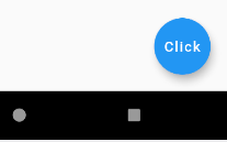
Floating Action Button
Floating Action Button은 항상 표시되는 원형 아이콘 버튼이며 일반적으로 화면 하단 맨 오른쪽에 위치하며
위치는 변경이 가능합니다.. Android 개발자들은 줄여서 FAB라고 부릅니다.
FAB를 생성하기 위해서 Scaffold 생성자로 넘겨줍니다.
FAB widget에 child를 추가 할 수 있으며 Icon 뿐만 아니라 Text Widget을 사용할 수 있습니다.
class MyApp extends StatelessWidget {
@override
Widget build(BuildContext context) {
return MaterialApp(
debugShowCheckedModeBanner: false,
home: Scaffold(
appBar: AppBar(
title: Text('App bar'),
backgroundColor: Colors.redAccent,
),
body: Text('This is body!!'),
floatingActionButton: FloatingActionButton(
// child: Text('Click'),
child: Icon(Icons.access_alarm),
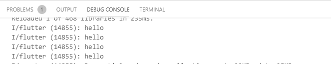
onPressed: ()=> {
print('hello')
},
),
));
}
}
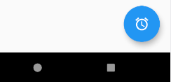
FAB를 클릭 할 때 마다onPressed에 정의한 Callback 메소드가 호출이 됩니다. 위 Sample 예제에서 클릭할 때마다 디버그 메시지를 출력하도록 하였습니다.
Bottom Navigation Bar
일반적으로 3 ~ 5 사이의 적은 수의 뷰 중에서 선택하기 위해 앱 하단에 표시되는 위젯입니다.
BottomNavigationBar는 텍스트 레이블, 아이콘 또는 둘 다의 형태로 여러 항목으로 구성이 됩니다.
보통 페이지 별 바로 가기 작업을 제공하기 위해 만들어집니다.
Widget build(BuildContext context) {
    return MaterialApp(
        debugShowCheckedModeBanner: false,
        home: Scaffold(
          appBar: AppBar(
            title: Text('App bar'),
            backgroundColor: Colors.redAccent,
          ),
          body: Text('This is body!!'),
          floatingActionButton: FloatingActionButton(
            // child: Text('Click'),
            child: Icon(Icons.access_alarm),
            onPressed: () => {print('hello')},
          ),
          bottomNavigationBar: BottomNavigationBar(
            items: <BottomNavigationBarItem>[
              BottomNavigationBarItem(
                icon: Icon(Icons.home),
                title: Text('Home'),
              ),
              BottomNavigationBarItem(
                icon: Icon(Icons.business),
                title: Text('Business'),
              ),
              BottomNavigationBarItem(
                icon: Icon(Icons.school),
                title: Text('School'),
              ),
            ],
            selectedItemColor: Colors.amber[800],
            backgroundColor: Colors.blueGrey[100],
          ),
        ));
  }
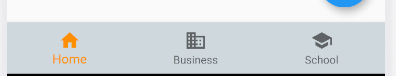
backgroundColor을 이용하여 배경색을 변경 할 수 있습니다.selectedItemColor을 이용하여 Item을 선택이 되었을 때 강조 색을 변경 할 수 있습니다.
참고로 위 코드를 그대로 실행하면 아래 버튼을 눌러도 아무 동작을 하지 않습니다.
위 동작을 구현하기 위해서는Statefull이라는 개념을 학습해야 합니다.
BottomNavigationBar에 대해서는 아래 링크를 참조 바랍니다.
https://api.flutter.dev/flutter/material/BottomNavigationBar-class.html
댓글남기기