Matplotlib
- Data를 시각화 하기 위한 library(그래프, 도표)
- Matlat과 유사한 인터페이스를 지원한다.
1. 선 그래프
1.1 Basic
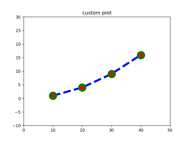
plt.title("custom plot") # title
plt.plot([10,20,30,40], [1,4,9,16], c='b', lw = 5, ls='--', marker = 'o', ms=15, mec='g', mew =5, mfc = 'r')
plt.xlim(0,50) # X 축 범위 지정
plt.ylim(-10,30) # Y축 범위 지정
plt.show()
1.2 Tick 지정
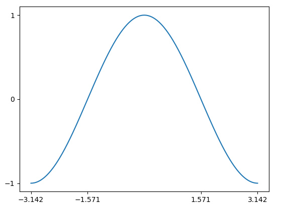
X =np.linspace(-np.pi, np.pi, 256)
C = np.cos(X)
plt.plot(X,C)
plt.xticks([-np.pi, -np.pi/2, np.pi/2, np.pi]) # 4개 지정
plt.yticks([-1,0,1]) # 3개 지정
plt.show()
1.3 Label, Title 지정
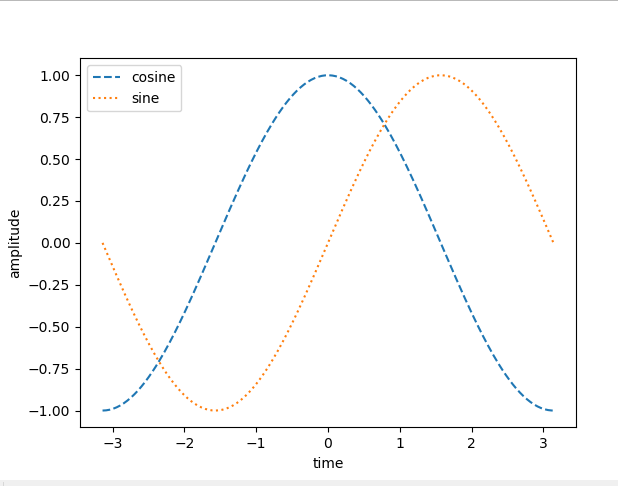
X =np.linspace(-np.pi, np.pi, 256)
C,S = np.cos(X), np.sin(X)
plt.plot(X,C, ls = '--', label = 'cosine')
plt.plot(X,S, ls = ':', label = 'sine')
plt.xlabel('time')
plt.ylabel('amplitude')
plt.legend(loc=2) # 범례 위치 지정
plt.show()
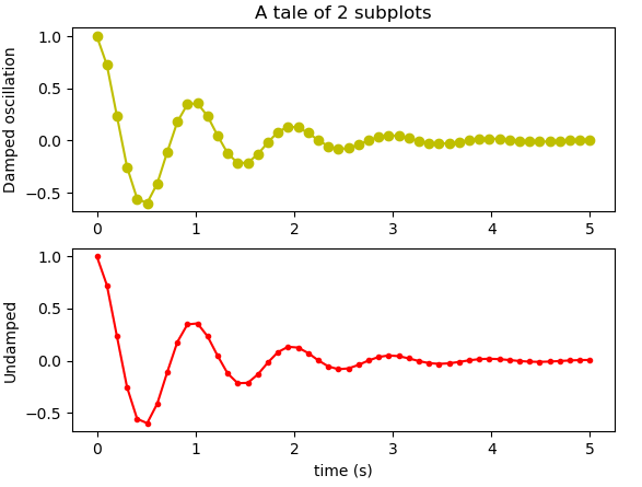
1.4 Sub plot 만들기
import matplotlib.pyplot as plt
import numpy as np

x1 = np.linspace(0.0,5)
x2 = np.linspace(0.0, 2)

y1 = np.cos(2 *np.pi * x1) *np.exp(-x1)
y2 = np.cos(2 *np.pi * x1) *np.exp(-x1)

ax1 = plt.subplot(2,1,1) # 2 * 1 axes를 만들고 가장 첫 번째 instance를 가져 온다
# subplot을 호출 한 이후 ax1에 직접 access 하지 않아도 값이 변경 가능하다.
plt.plot(x1, y1, 'yo-')
plt.title('A tale of 2 subplots')
plt.ylabel('Damped oscillation')

ax1 = plt.subplot(2,1,2)
plt.plot(x1, y1, 'r.-')
plt.xlabel('time (s)')
plt.ylabel('Undamped')
plt.show()
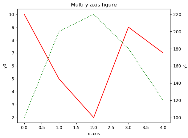
1.5 Multi Y axis 만들기
fig, ax0 = plt.subplots()
ax1 = ax0.twinx()

ax0.set_title('Multi y axis figure')
ax0.plot([10,5,2,9,7], 'r-', label = 'y0')
ax0.set_ylabel('y0')

ax1.plot([100,200,220,180,120], 'g:', label = 'y1')
ax1.set_ylabel('y1')

ax0.set_xlabel('x axis')
ax0.grid(False)

plt.show()
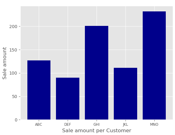
2. 막대 그래프
import matplotlib.pyplot as plt
import numpy as np
plt.style.use('ggplot') # ggplot 스타일 적용

customers = ['ABC', 'DEF', 'GHI', 'JKL', "MNO"]
customers_index = range(len(customers))
sale_amount= [127, 90,201 ,111, 232]

fig = plt.figure()
ax1 = fig.add_subplot(1,1,1)
ax1.bar(customers_index, sale_amount, align = 'center', color = 'darkblue')

ax1.xaxis.set_ticks_position('bottom')
ax1.yaxis.set_ticks_position('left')
plt.xticks(customers_index,customers,rotation = 5, fontSize = 'small')
# rotation : x label의 기울기를 지정 할수 있다.

plt.xlabel("Customer name")
plt.ylabel("Sale amount")
plt.xlabel("Sale amount per Customer")

plt.savefig('bar_plot.png', dpi =400, bbox_inches = 'tight') # file 저장
plt.show()
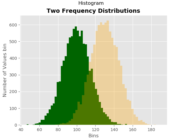
히스토그램
import matplotlib.pyplot as plt
import numpy as np
plt.style.use('ggplot') # ggplot 스타일 적용

mu1, mu2, sigma = 100 ,130, 15
x1 = mu1 + sigma* np.random.randn(10000)
x2 = mu2 + sigma* np.random.randn(10000)

fig = plt.figure()

ax1 = fig.add_subplot(1,1,1)

ax1.hist(x1, bins = 50, color = 'darkgreen')
ax1.hist(x2, bins = 50, color = 'orange', alpha = 0.3)
ax1.xaxis.set_ticks_position('bottom')
ax1.yaxis.set_ticks_position('left')

plt.xlabel('Bins')
plt.ylabel("Number of Values bin")
ax1.set_title('Two Frequency Distributions')

fig.suptitle('Histogram', fontsize=14, fontweight='bold')

plt.show()
댓글남기기